Re-branding Fortune!
Team NRay took a deep breath and started putting our thoughts on paper.
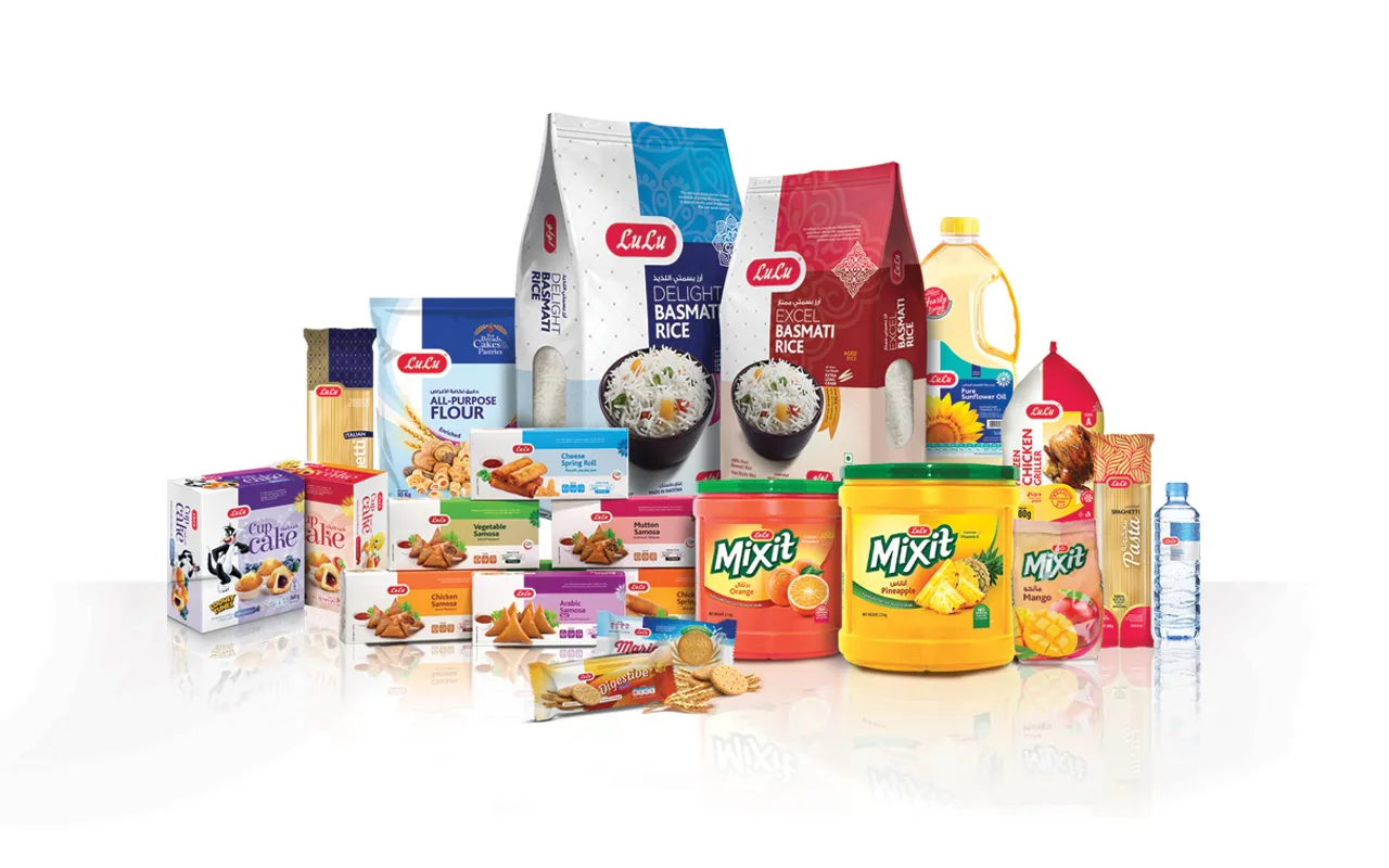
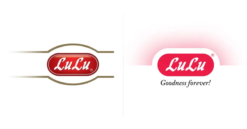
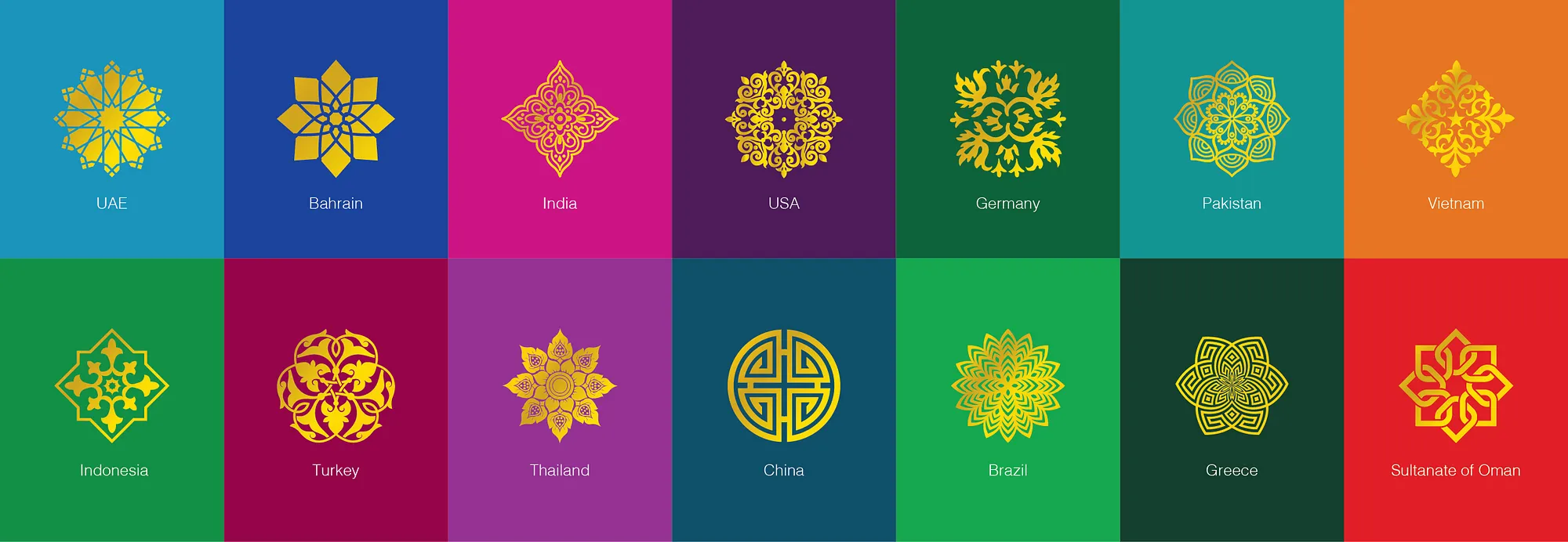
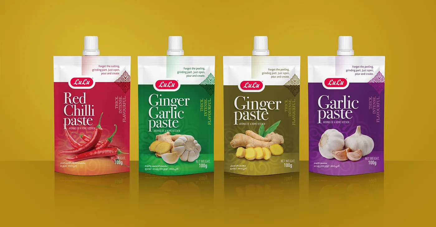
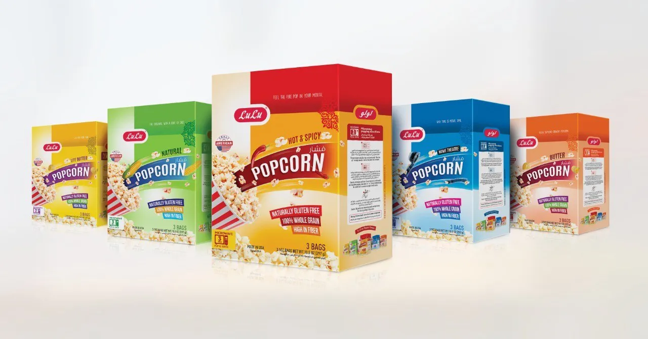
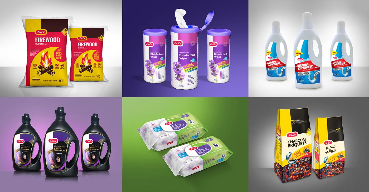
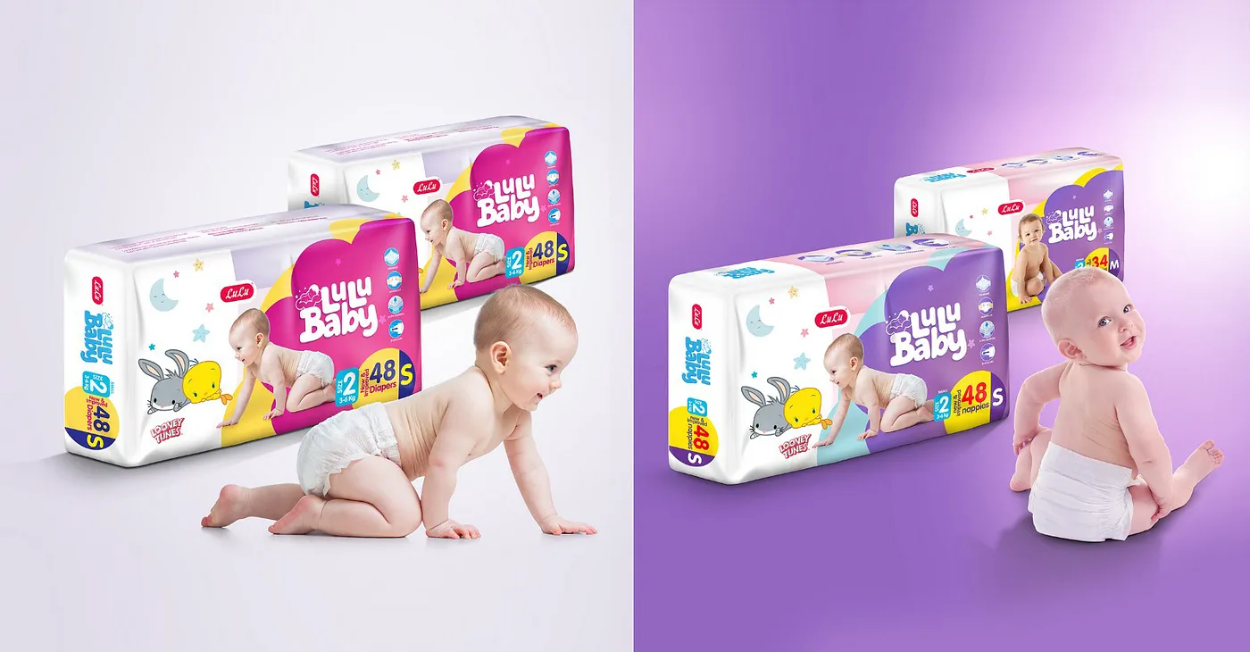
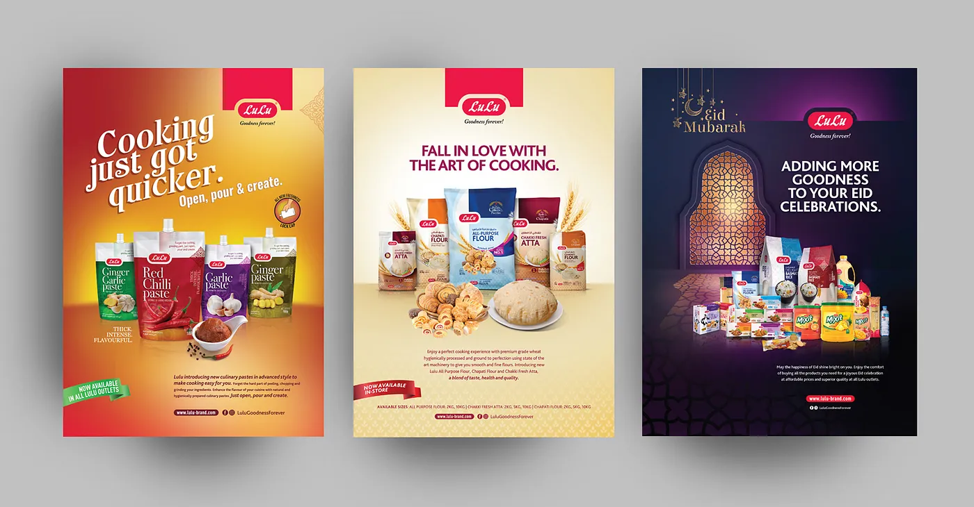
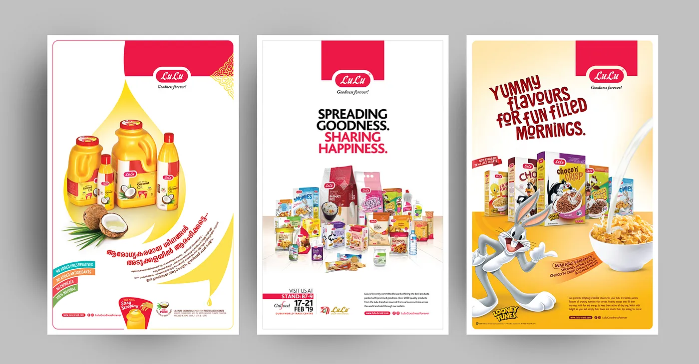
The task was to bring about a brand-new look and feel to more than 3500 different product packaging designs. The requirement was to improve visibility and the pick-me-up factor, to easily and interestingly communicate with the consumer about the product USP’s, to cut-the-clutter and stand-out in supermarket shelves. After thorough market research, trend analysis and customer interaction surveys we came up with a brand-new grid, to give the trusted label a young, fresh and lively feel. Keeping in mind the key design factors through which a logo communicates with a customer, from shelves, the logo was refined. By retaining the time-tested font and brighter color of the brand color, the new logo stands neat and communicates straight, without any distraction.
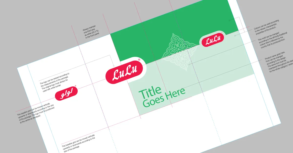
The result was astonishing. A task which saw, the coming together of a talented team at NRay lead by our creative director Mr. Muhammed Nausheer and senior designers to bring about a change in the packaging design of a giant brand. This doesn’t change the brand alone. But it changed the way we at NRay saw a brand identity and how to go about re-branding one. A lesson we all learned by executing it. What a way to learn!
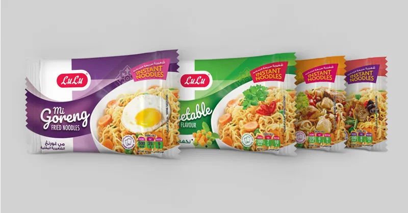
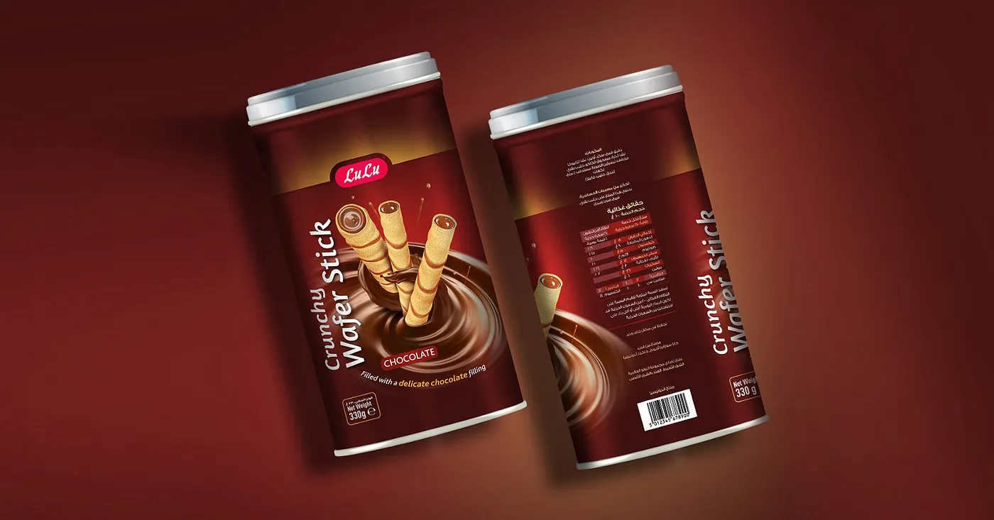
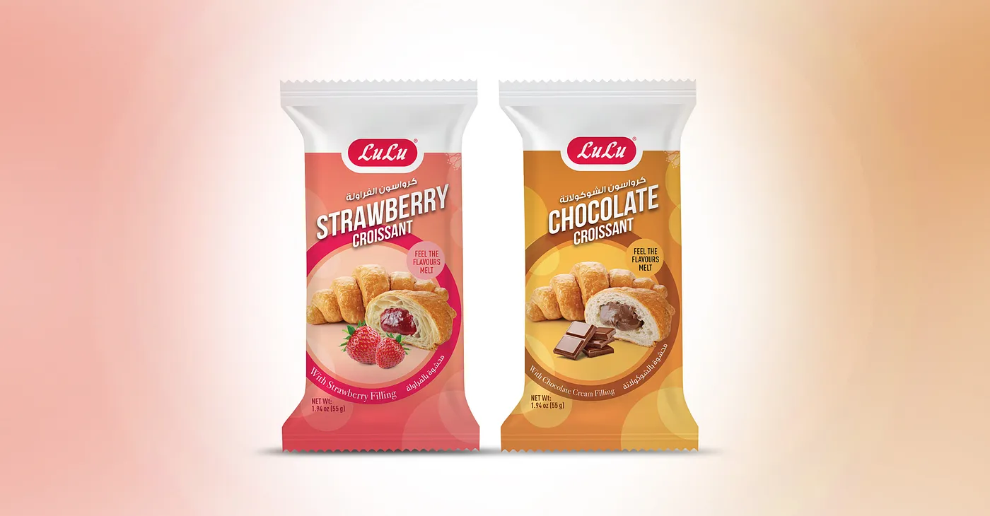
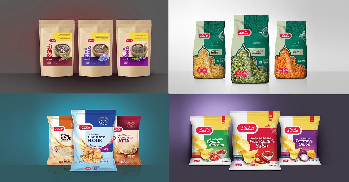
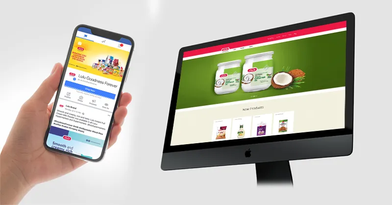
Sincere gratitude to the Lulu management from Team NRay for their trust in us.
